Home
Today's Optimisations
Oct 24, 2013
Mid-morning update on today’s optimizations:
- Gzip compression for all interaction with server
- Bandwidth reduction of 75%
- Overall summary size down to 150Kb from 700Kb
- Hence, speed of getting a response from server up 4 times
- Precalculation of search section combinations
- Various section combinations results are precalculated (kept alive)
- This applies to different time periods (selected at the top)
- Summaries should on average now load in 2 seconds
New Release: Circle Menus
Oct 23, 2013
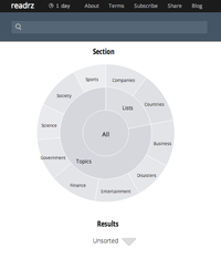
Yesterday a new version of the website I was talking about was finally released – horay! It features new section selectors based on Bilevel Partition by Mike Bostock of NY Times. Using two circles, it makes it very easy to mix and match data along different dimensions. Front page looks like a search engine (because it is!) now:

Cross-Section Design Progress
Oct 14, 2013
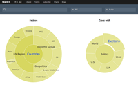
Progress update on cross-section interface design. The menus are ready! The screenshot shows how you would be able to filter the news about the Elections in different Countries.

(You would also be able to select Countries by starting from Elections, however in that case the second menu would be customized for your first selection of Elections.)
Now implementing a new layout for news blocks as discussed in the previous post.
Cross-Section Interface Design
Oct 10, 2013
Readrz search engine uses several unique algorithms, which in combination provide a service that is not available anywhere else:
- Automatic detection of article topics – and search by these topics
- Summarization of multiple articles into a two-level tree
- Cross-sectional topic analysis of results
Cross-sectional topic analysis allows you to intersect two topics, and see the results that have both of them. It is the highest-level feature that is supported by all other lower-level functionality. It is the top of the pyramid of code, and it is the most useful feature – it is at the pinnacle of what Readrz can do.
Now, cross-sectional analysis user interface… here we come to the dark area. Of course, you can imagine how that can work. First, you choose one section. Second, you choose another section. And voila, you are looking at the cross-section. You can already do cross-sectional analysis at the current website, which uses two different menus allowing you to choose first and second sections.
Using two menus is not a good idea for cross-sectional user interface:
- It looks like a usual user-interface that you see on all websites, so it doesn’t provide any indication that Readrz can do something that other search engines can’t do
- There is no clear indication of a link between two menus – it is not obvious that the second one depends on selection in the first, and that they together produce a cross section of results
That’s why we’ve been working on a completely new user interface for cross-sectional search.
Recently, I have learnt about the D3 javascript library, which can do amazing things (data-driven display of information for the web). After that we have spent a few days experimenting and working on the ideas for a new design.
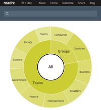
Here is how the home page will approximately look like (using Bilevel Partition Sunburst):

I am attaching some sketches that show how cross-sectional design will work (see below).
I am working hard on implementing it right now…
Skimming through Layouts
Oct 7, 2013
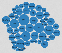
I have been experimenting with D3 trying to use smart layouts for displaying table of contents. I mainly looked at Packed Circles and Treemap.
These layouts are very useful for highlighting the biggest items in a collection. But I decided that why neither of these layouts is suitable for displaying table of contents, which has a number of small items that are comparable in size.


What I am trying to achieve is to minimize the time that a user would need to skim through the table of contents. But these layouts do not provide any linear strategy for a user to look through all the items. You can never be sure you have seen all of the items.
If the table of contents was represented as a plain list, then the strategy is simple – look through the entire list. However, the table of contents needs to be compact. And so the only reasonable option that remains is a table. User could look through all cells in a table by looking through individual rows (or columns). Additional styling (like font size) can help in locating the most prominent entries quickly.