Skimming through Layouts
Oct 7, 2013
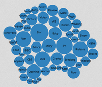
I have been experimenting with D3 trying to use smart layouts for displaying table of contents. I mainly looked at Packed Circles and Treemap.
These layouts are very useful for highlighting the biggest items in a collection. But I decided that why neither of these layouts is suitable for displaying table of contents, which has a number of small items that are comparable in size.


What I am trying to achieve is to minimize the time that a user would need to skim through the table of contents. But these layouts do not provide any linear strategy for a user to look through all the items. You can never be sure you have seen all of the items.
If the table of contents was represented as a plain list, then the strategy is simple – look through the entire list. However, the table of contents needs to be compact. And so the only reasonable option that remains is a table. User could look through all cells in a table by looking through individual rows (or columns). Additional styling (like font size) can help in locating the most prominent entries quickly.